It goes without saying that project managers must deliver a project within set deadlines and arrest any issues that may arise and cause delays during execution. However, this isn’t always the easiest thing to achieve. That’s where a burndown chart comes in.
A burndown chart helps project managers with project time tracking what the team has done, what they need to do, and how much time is left in the project. It’s an excellent tool for visualizing and managing your team’s workload and schedule.
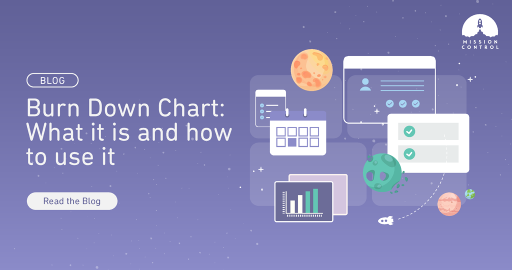
In this article, we look at what a burndown chart is, its components, benefits, and limitations.
Burndown Charts Defined
A burndown chart is a graphical illustration showing your project’s progress in relation to a customer’s requirements. It shows how many project tasks the team has completed and how many they’re yet to finish during a selected period.
The vertical axis shows the amount of work still pending, while the horizontal axis represents the amount of time that’s passed since the project started.
As the team completes tasks, the graph “burns down” to zero on or before the last day of the period. Hence, the name burndown chart.
Burndown reports are popularly used for agile projects, but they’re also gaining popularity in other project management methodologies.
To summarize, a burndown chart is a helpful tool for project monitoring and managing progress. The chart reflects the project’s current status enabling teams to estimate when the project will be complete.
Benefits of Using a Burndown Chart in Project Management?
Here’s why burndown charts are helpful for all types of projects.
Easy to understand
The visual nature of burndown charts makes them easy to understand. Teams can visualize their progress in real time, keeping everyone on the same page at any given moment.
Improve transparency
Since the charts are displayed for everyone, teams will feel encouraged to evaluate their performance and update work estimates constantly. This enhances transparency within the team.
Reduce risks
Burndown charts give project teams daily feedback about the schedule, actual work, and estimated work. These powerful insights enable teams to respond to issues and quickly make adjustments before they escalate.
Manage scope creep
As you identify bottlenecks, you can quickly create a new burndown chart that maps out your client’s remaining requirements and decide how to progress without throwing the project into scope creep.
Save time
It’s relatively easy to create and update a burndown chart. It’s also faster to track progress on a burndown chart than comb through email and other documents to determine your project’s current status.
Encourage team collaboration
Effective collaboration occurs when everyone knows what is going on and works towards a similar goal. The visual representation burndown charts offer keeps everyone in the loop and on the same page.
Keep teams motivated
The constant comparison between the planned and actual progress on the graph keeps team members motivated to perform consistently. The chart helps team members to stay focused on their jobs, increasing productivity.
Better project planning
Burndown charts offer project managers a holistic overview of the project. They can rely on the chart to create more accurate project timelines and effectively manage resources.
Key Elements of a Burndown Chart
The specifics of a burndown chart can vary from one project to another. However, the following elements are common to a typical burndown chart.
The Y-axis (vertical axis)
The Y-axis tracks the amount of work remaining in the project.
The X-axis (horizontal axis)
The X-axis tracks the time remaining until the project’s deadline.
Ideal work remaining line
As the name suggests, the ideal work remaining shows the unfinished work that a team has at a specific point of the project under ideal conditions. It’s shown as a diagonal line sloped downwards. Ideal work remaining is an estimation made using past data and is used in comparison with actual work remaining to determine whether the team is on the right track to beat the deadline.
Actual work remaining line
The actual work remaining line shows incomplete tasks at any point of the project. Unlike the ideal remaining work, actual work remaining is not an estimate but a realistic depiction of the team’s progress. Team members update this metric in real-time as teams complete tasks. This line won’t typically be straight as people complete tasks at different paces.
Are There Any Limitations of Burndown Charts?
While burndown charts help manage projects efficiently, they also come with a few downsides.
Don’t tell the whole story
The burndown chart only shows the number of tasks that have been completed but leaves out any changes in the scope of work. Therefore, it becomes hard to tell whether changes on the graph result from completed backlog items or because of a change in user requirements.
Rely heavily on accurate data
For a true representation, the team needs to make accurate time estimates. If, for instance, the team regularly underestimates the time requirements, it will always seem to be behind schedule even though they’re working productively. This could lead to demotivation.
Don’t show when work will be completed
The chart only reveals the team’s current progress and remaining work, not how close it is to finishing the work.
Don’t account for backlog items
There’s no room in the chart to indicate which backlog items the team has completed. The graph will continue to show that the team is progressing but won’t show that progress is from backlog tasks.
Ready to take your project management to the next level?
A burndown chart is a great tool to help you organize and monitor your project timelines and progress.
You can take your project tracking to the next level with a project management tool such as Mission Control. The software has all the features you need to fully monitor and manage your projects, including, but not limited to:
PMO dashboard: Our project dashboard offers a high-level view of your project and tracks real-time progress.
Kanban: Use our in-built Kanban boards to visualize workflows, map out dependencies and prioritize tasks.
Baseline Tracking: This feature allows you to compare your actual delivery dates against your baseline dates so that you don’t lose track of original project commitments and expectations.
Gantt chart: Our interactive Gantt chart allows you to visualize the entire project timeline, including actions and milestones.
Mission Control is a comprehensive Salesforce Time Tracking software application. Make sure you check out our other Time Tracking Best Practices.
Ready to supercharge your project management? Request a demo to see how Mission Control can help you.